
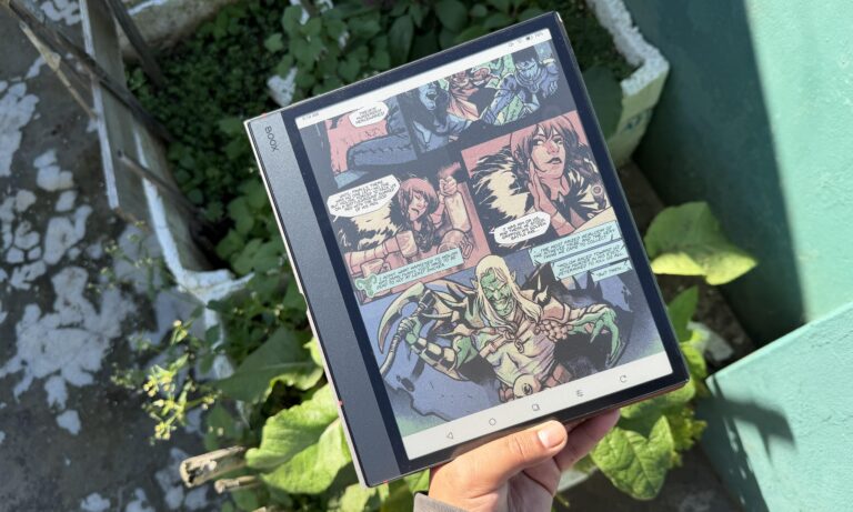
Color E Ink tablets are popular for comics, PDFs, and note-taking because they add color while keeping the eye-friendly benefits of E Ink. However, many users notice that compared to black-and-white e-readers, the screen looks darker, grayer, and less crisp.
This difference is noticeable enough that some customers return their devices, describing the display as “dim” or “muddy” compared to monochrome E Ink.
So why does this happen?
In short, color E Ink sacrifices brightness and contrast in order to enable color.
Let’s look at the technical reasons behind it.
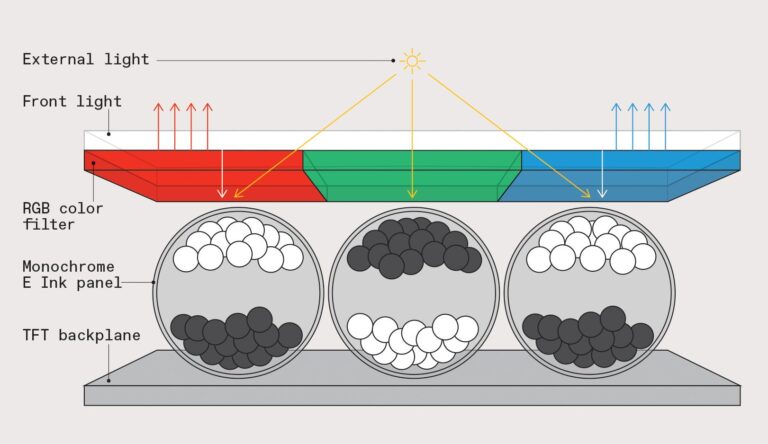
1. A color filter layer reduces brightness (core reason)
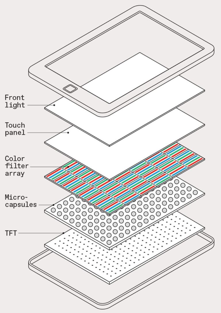
Most modern color E Ink displays (like Kaleido 3) are built on a standard black-and-white E Ink panel with an added color filter array (CFA) to create red, green, and blue sub-pixels.
E Ink explains that this technology uses a thin filter layer on top of a monochrome display to enable color.
The downside is that this filter absorbs and blocks part of the reflected light, so less light reaches your eyes. Instead of reflecting directly like in black-and-white E Ink, the light is filtered and weakened.
This reduction in reflected light is the main reason color E Ink screens look darker.
2. Even “white” backgrounds are no longer pure white
In black-and-white E Ink, the background is created by highly reflective white pigment particles.
But in Kaleido-style color E Ink:
- that white light must pass through a color filter grid
- some wavelengths are absorbed
- the result is a grayish or tinted white background
As a result, the “white page” is no longer truly white, it’s slightly muted.
Industry analysis consistently notes that Kaleido screens look darker because the CFA “absorbs some light, reducing overall reflectivity”
3. Lower contrast makes everything feel darker
Brightness isn’t the only factor, contrast is equally important.
Monochrome E Ink offers:
- bright white background
- deep black text
- strong separation between foreground and background
Color E Ink weakens this separation because:
- the background is darker
- blacks are slightly softened
- light scattering increases
According to technical breakdowns, Kaleido screens inherently reduce contrast because the color layer “lets less light through and creates a dimmer background”.
Even if brightness is technically acceptable, the eye perceives lower contrast as a darker screen.
4. Color mode reduces effective resolution (adds “muddy” effect)
Color E Ink splits resolution between black-and-white and color modes.
Typically:
- 300 PPI in BW mode
- ~150 PPI in color mode
This happens because multiple pixels are needed to form one color pixel.
As a result, colors look:
- softer
- less sharp
- slightly washed out
Even if brightness stays the same, this lower sharpness makes the display feel more “dull.”
5. Physical structure creates a “screen door effect”
Because color is produced using a grid of microscopic RGB filters, the screen has a subtle layered structure.
This can create:
- faint grid patterns
- uneven light diffusion
- slight haze over white areas
Users often describe it as looking through a “screen door” or tinted film.
Reddit users and testers frequently report that Kaleido 3 feels “darker and less contrasty, like a grey filter over the screen”
6. Frontlight helps—but cannot fully solve it
Most color E Ink tablets include a frontlight system to compensate.
When turned on:
- brightness improves significantly
- contrast becomes more usable
- color becomes more visible
However, the key limitation remains:
the color filter still reduces optical efficiency
Choosing between Color and Black & White E Ink
Black & White E Ink (BW)
Best for: novels, long-form reading, distraction-free use
Advantages:
- brighter white background
- higher contrast
- sharper text (300 PPI)
- more paper-like reading experience
Still the best choice for pure reading.
BOOX BW devices:
- BOOX Go 7
- BOOX Palma 2
- BOOX Go 10.3 and Gen II Lumi
- BOOX Note Max
- BOOX Go 6
PocketBook BW devices:
- PocketBook Era
- PocketBook InkPad 4
- PocketBook Verse series
Color E Ink (Kaleido 3)
Best for: comics, PDFs with visuals, color notes, mixed media
Advantages:
- ~4,096 colors
- better for charts and diagrams
- more flexible for productivity
Limitations:
- darker screen (color filter layer)
- lower color resolution (~150 PPI)
- reduced contrast vs BW
- more reliance on frontlight
Best viewed as a multimedia upgrade, not a replacement for BW.
BOOX color devices:
- BOOX Note Air 5 C
- BOOX Go Color 7 (Gen II)
- BOOX Tab X C
- BOOX Palma 2 Pro
PocketBook color devices:
- PocketBook InkPad Color 3
- PocketBook Verse Pro color
- Pocketbook Era Color
- PocketBook InkPad EO
- PocketBook Color Note