

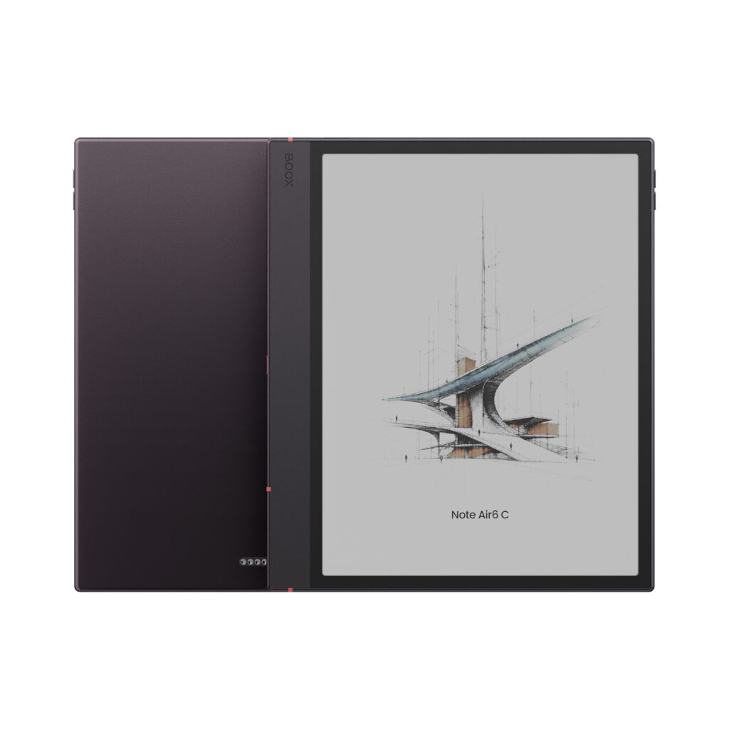
Colour E Ink is one of the most requested technologies in our store, and for good reason. Seeing book covers, highlighted notes and charts in colour on a screen that still feels like paper is genuinely appealing.
But colour E Ink is not a tablet LCD, and it is not a black-and-white eReader with colour added for free. Every colour screen involves trade-offs. Customers who know them in advance tend to love their device. Customers who expect iPad-like colour are often disappointed.
This guide explains how Kaleido 3 works, what it does well, where it falls short, and how to set it up for the best picture. We use two of the most popular Kaleido 3 devices as examples: the BOOX Note Air 6 C and the BOOX Go Color 7 (Gen II).
What is Kaleido 3?
Kaleido 3 is E Ink’s current-generation colour ePaper. It starts with a standard black-and-white E Ink panel and adds a thin colour filter layer on top. Each group of pixels sits under red, green and blue filters, and the screen mixes them to produce up to 4,096 colours.
This design has two important consequences:
- Text stays sharp. Black-and-white content is shown at the full 300 ppi of the underlying panel.
- Colour is lower resolution. Because filters group the pixels together, colour images are shown at 150 ppi.
The filter also absorbs some of the light that would otherwise bounce back from the white background. That single fact explains most of what you will notice about a colour screen in daily use.
What Kaleido 3 does well
- Colour where it adds meaning. Highlights, coloured pen strokes, annotated PDFs, charts, maps, comics and book covers are easier to read and more enjoyable in colour.
- Still ePaper. The screen reflects ambient light instead of shining into your eyes, so long sessions stay comfortable and readable in daylight.
- Sharp text. Text is rendered at the same 300 ppi resolution as on a black-and-white screen, so letters keep their fine detail.
- Colour note-taking. On the Note Air 6 C you can write and sketch in several ink colours, which helps when organising notes, studying or marking up drafts.
- Mild, pastel colours. Colours are soft rather than vivid. For many people that is part of the appeal: calm, paper-like, easy on the eyes.
The trade-offs you should know before buying
1. The background is darker
This is the number one surprise for new owners. The colour filter makes the “white” of the page look light grey, especially indoors. Next to a black-and-white eReader, the difference is obvious. In practice, most people read a Kaleido 3 device with the front light on, at least at a low level.
2. Lower contrast
Because the background is greyer, black text stands out less against it. Text is still sharp, but the page has less “pop” than on a black-and-white screen.
3. Colours are muted
Kaleido 3 shows soft, pastel colours. Photos, artwork and video thumbnails will never look like they do on a phone or iPad. Colour is best for highlights, diagrams, covers and comics, not for photos.
4. Colour images are 150 ppi
Text is 300 ppi, but colour content is shown at half that resolution. Small coloured details in dense PDFs, maps or scientific diagrams can look grainy up close.
5. Front light changes how colours look
Warm (yellow) light tints the whole page, including colours. A warm setting that feels cosy for reading text can make colours look washed out or yellowish. Colour devices also tend to look noticeably darker at low and medium brightness than at the top of the range.
6. Shorter battery life in real use
Kaleido 3 itself uses no more power than black-and-white E Ink. But because most people keep the front light on more often, batteries drain faster than on an equivalent black-and-white device.
7. More visible ghosting
Faint traces of the previous page (ghosting) are more noticeable on colour screens. It is normal for E Ink and is cleared with a full screen refresh, which you can automate (see the settings below).
8. Small edge shadow on the Go Color 7 (Gen II)
BOOX notes that the front light on this model may create a slight shadow along one side of the screen. It is a known characteristic of this design, not a defect, and it is usually minimised by adjusting brightness and colour temperature.
Kaleido 3 in practice: two popular BOOX models
BOOX Note Air 6 C (10.3″)
The Note Air 6 C is a 10.3″ Android note-taking tablet with a Kaleido 3 screen, front light and the BOOX Pen 3 stylus. It is built for people who write, annotate and work with documents, not only read.
Where colour pays off: colour-coded handwritten notes, highlighted PDFs and textbooks, charts and slides. The large screen also makes 150 ppi colour less of an issue than on a small device, because diagrams are displayed bigger.
What to keep in mind: like every Kaleido 3 device, the page is darker than on a black-and-white tablet, so plan on using the front light indoors.
BOOX Go Color 7 (Gen II) (7″)
The Go Color 7 (Gen II) is a compact 7″ Android eReader with physical page-turn buttons, Google Play access and optional stylus support.
Where colour pays off: comics, manga, children’s books, magazines and book covers, all in a pocketable size.
What to keep in mind: its colour temperature leans warm, so pages and colours can look yellowish if the warm light is turned up. If you mainly read novels, its black-and-white sibling will give you a whiter page and stronger contrast (see our recommendation below).
How to get the best picture from a Kaleido 3 screen
A few minutes of setup makes a bigger difference on colour E Ink than on any other screen. Menu names below may vary slightly between BOOX firmware versions.
- Update the firmware first. Connect to Wi-Fi and install the latest system update before judging the screen. BOOX regularly improves display and refresh behaviour.
- Use the front light indoors. Even a low setting lifts the greyish background noticeably. In bright daylight you can switch it off to save battery.
- Keep the light cool or neutral for colour. Warm light tints colours yellow. For the most accurate colours and the highest contrast, use a higher brightness with little or no warm light. Save the warm setting for evening reading of plain text.
- Avoid the very bottom of the brightness scale. Colour screens look disproportionately dark at low and medium settings. A moderate setting usually looks much better than a minimal one.
- Tune each app individually. Long-press an app icon and open its optimisation settings. Increase contrast, enable dark colour enhancement to make text blacker, and use the colour saturation option if colours look too faint. BOOX remembers these settings per app.
- Pick the right refresh mode. Use HD mode for reading and note-taking: it gives the cleanest image. Switch to Balanced or Fast only for scrolling and web browsing.
- Automate full refreshes. Set a full screen refresh every few pages to clear ghosting automatically. On colour screens, a slightly more frequent refresh is worth it.
- Read in good ambient light. ePaper is reflective, so it looks its best near a window or under a good lamp, just like paper.
- Choose content that suits colour. Covers, comics, highlights and diagrams look great. Photo galleries and video will always look muted.
- For the Go Color 7 (Gen II) edge shadow: adjust brightness and colour temperature together until the shadow disappears or becomes negligible.
Colour or black and white? Our honest recommendation
Choose Kaleido 3 colour if you regularly work with highlighted PDFs, colour-coded notes, charts, textbooks, comics or magazines, and colour genuinely helps you understand or enjoy the content.
Choose black and white if you mainly read books, articles and documents, or take notes in a single colour.
Here is the simple reason. If you read books, almost everything you will ever see on the screen is black text on a white page. Colour only shows up on the cover and the occasional illustration. For that kind of use, a black-and-white screen is simply better:
- A whiter page. Without a colour filter, the background is noticeably brighter and closer to real paper.
- Higher contrast. Black text stands out more sharply, which makes long reading sessions easier.
- Less need for the front light. It reads comfortably in normal room light, and the battery lasts longer as a result.
- Less ghosting and a cleaner image overall.
- Usually a lower price for the same screen size.
In short: buy colour for the content that needs it. For reading text, black and white is the better screen.
| If you like… | Colour (Kaleido 3) | Black-and-white alternative |
|---|---|---|
| A 10.3″ tablet for notes and documents | BOOX Note Air 6 C | BOOX Go 10.3 (Gen II) Lumi (with front light) or BOOX Go 10.3 (Gen II) |
| A compact 7″ eReader with page buttons | BOOX Go Color 7 (Gen II) | BOOX Go 7 |
See the difference for yourself
The best way to choose between colour and black and white is to look at both screens side by side. Visit our showroom at Improve Canada Mall in Vaughan, Ontario (by appointment) and compare Kaleido 3 and black-and-white BOOX devices under the same light.
Not near Vaughan? Contact us before you order and tell us what you plan to read or write. We will help you pick the right screen. EINKTAB devices come with a 30-day risk-free trial, a 12-month Canadian warranty and local technical support.